drag and drop
Building a shared drag and drop component and interaction pattern for Zendesk products
Context
Drag and drop has been a staple of graphical interfaces since the earliest GUIs. It lets people group, reorder, move, or resize objects by grabbing and dragging. The interaction feels simple and direct, which is why teams reach for it so often.
Challenge
Two different product teams—Report Builder and Layout Builder—were each planning to build drag and drop interactions from scratch to drive their experiences. Solving for those problems in isolation risked inconsistent UX, gaps in accessibility, and duplicated engineering effort.
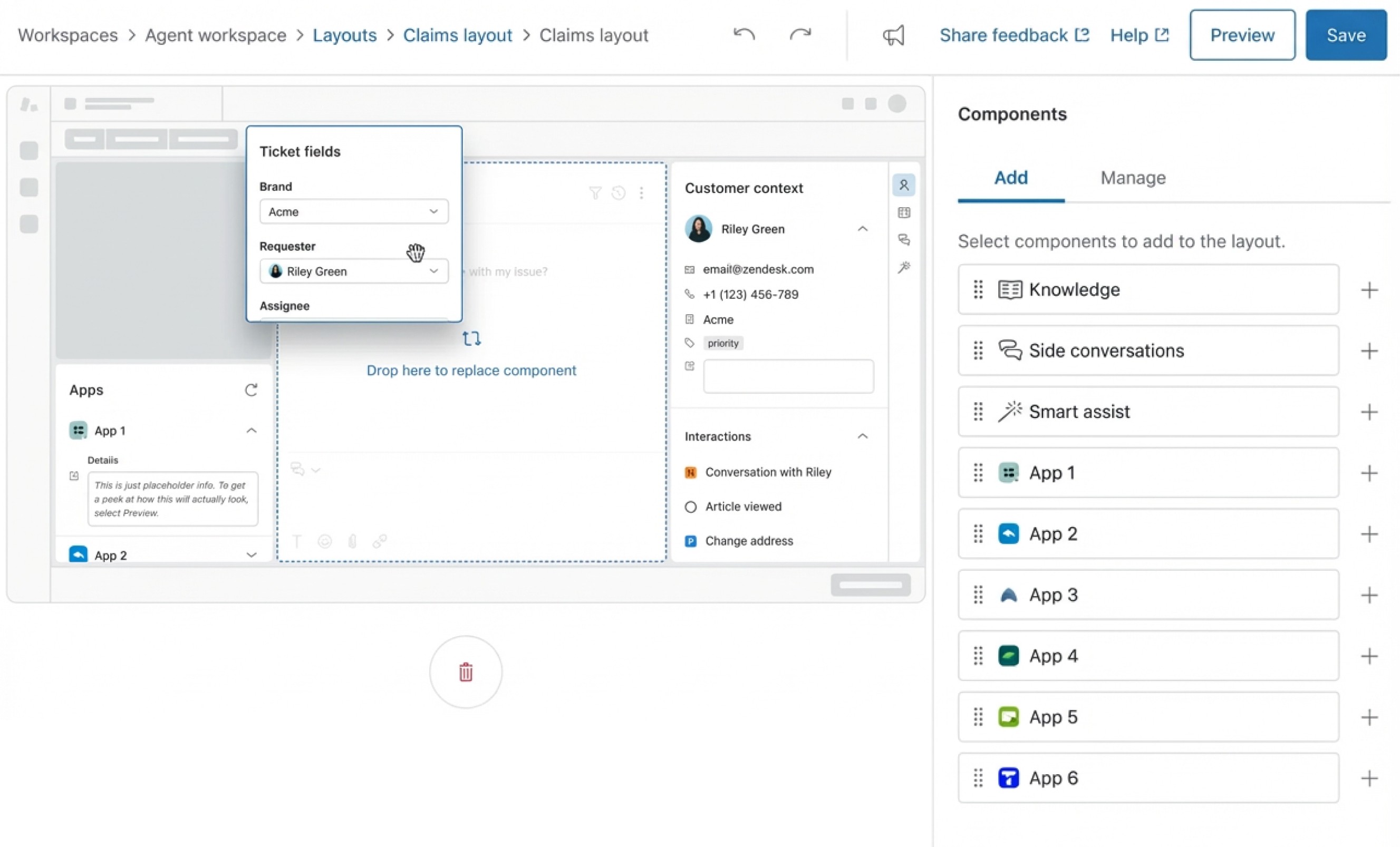
Layout builder
Lets users rearrange and resize interface panels to customize their workspace. Driving the new direction for Zendesk’s UI across multiple products.
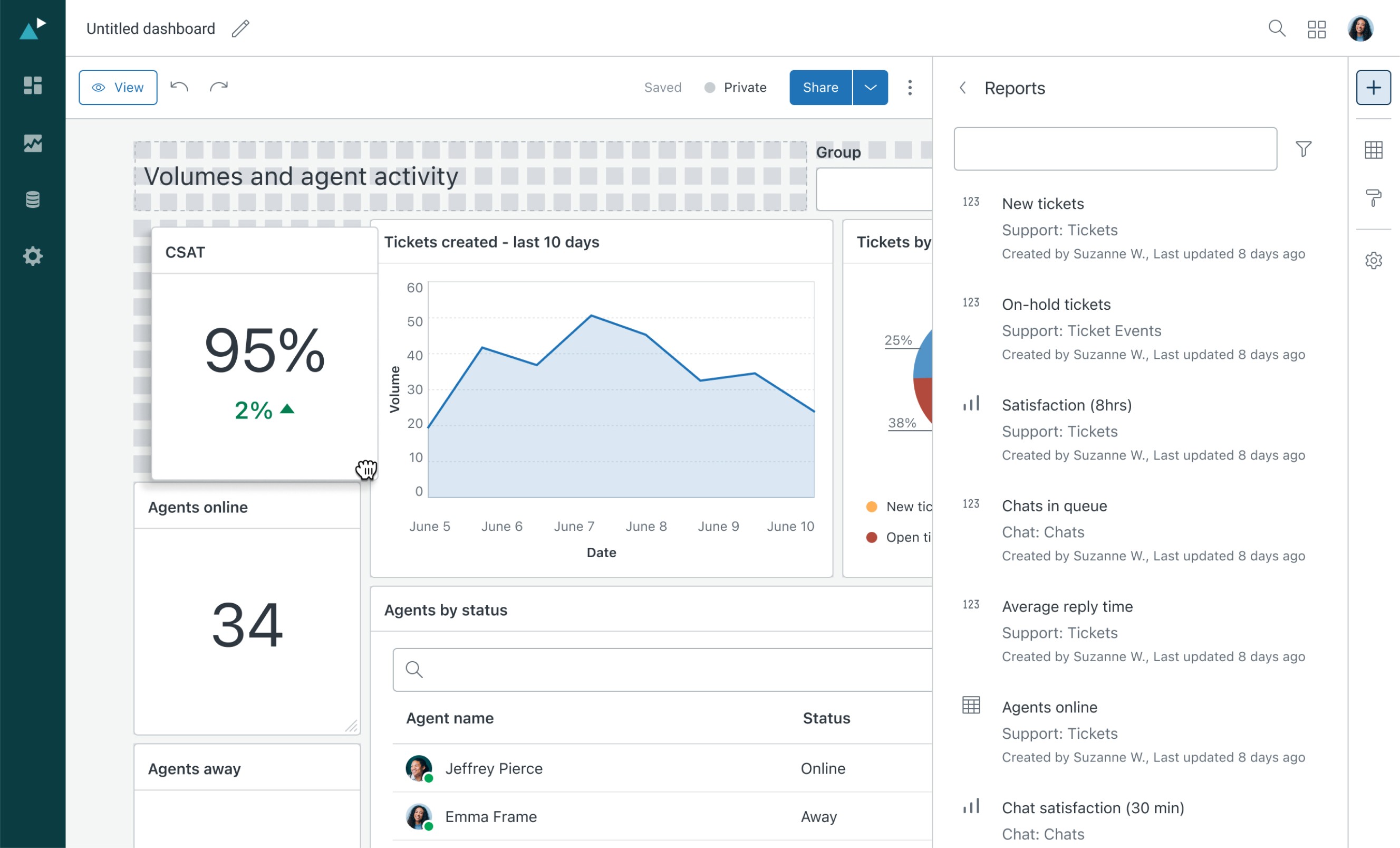
Report builder
Enables users to build and organize data visualizations using a drag-and-drop interface. Requires flexible grouping, ordering, and nesting behaviors.
opportunity
A shared drag and drop pattern would let both teams ship faster, align on accessibility and interaction standards, and prevent repeated bespoke implementations across products.
We chose to build a drag and drop component that is accessible (keyboard and screen reader functionality), includes clear visual feedback, and is flexible to cover multiple scenarios while remaining consistent across products.
Outcome
A robust and highly configurable drag-and-drop component, fully accessible by default. Bundled with the tooling and documentation teams need to ship it confidently.
React component package: A complete “Draggable” package with a rich prop interface for flexible configuration and baked-in accessibility. The package also ships with comprehensive storybook examples based on approved use cases around Zendesk.
Figma component with code parity: A Figma component offering the same flexibility as its code counterpart through matching variants and properties. It includes in-page examples and documentation to help designers use it correctly.
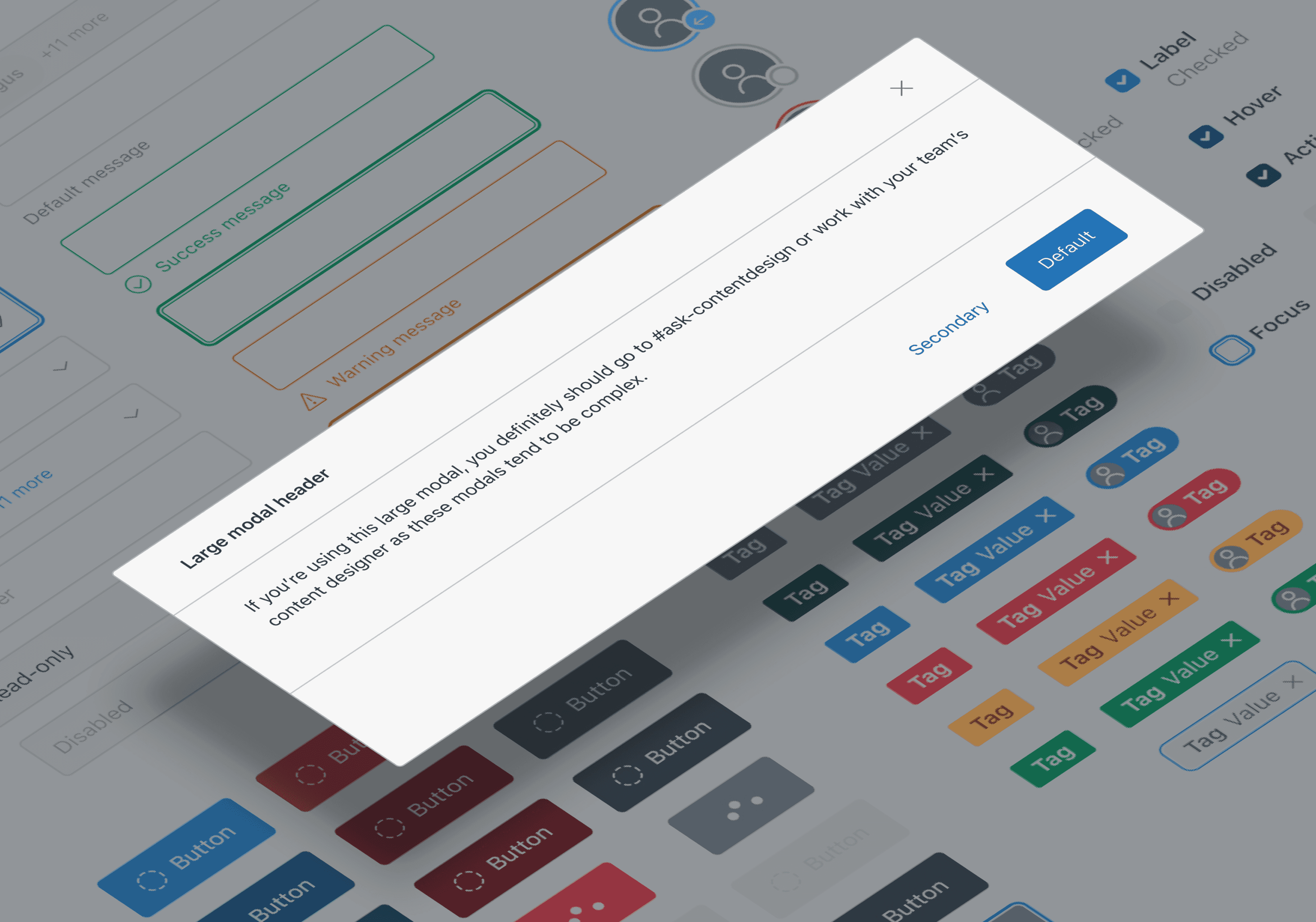
Pattern documentation: An in-depth guide covering how to build drag and drop experiences with the component. It includes styling, interaction behavior, accessibility, and best practices for managing complex drag and drop scenarios
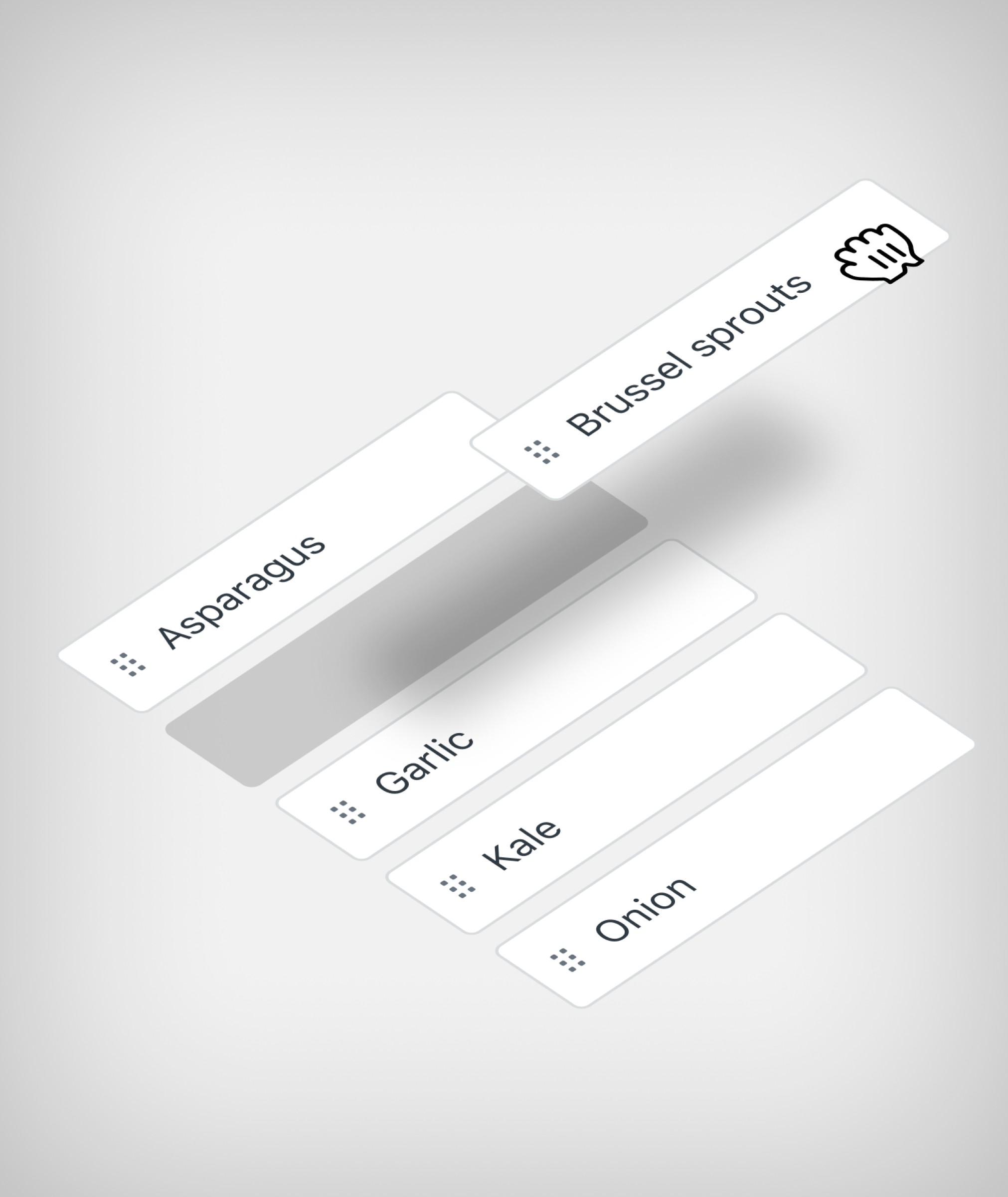
Draggable component
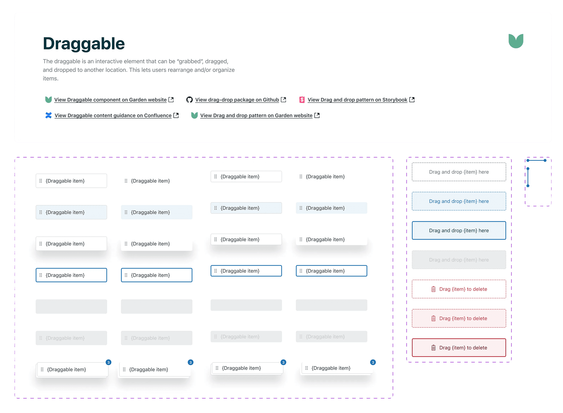
The "Draggable" component in our Figma library provides links to live documentation on our website and Confluence, the code package in Github, and interactive examples in Storybook.
The component package consists of three building block elements:
Draggable item: The item being moved, with variants for interaction states, style, and placeholders
Dropzone: The area that receives the item, with its own states and visual treatments
Drop indicator: The element shows where dragged items will appear upon release
The library also includes in-page examples of common use cases with matching content guidance to help designers use it correctly
To help teams ship drag and drop confidently, we published detailed but clear pattern guidance that walks through anatomy, accessibility requirements, interaction behavior, and common use cases.
Impact
Both teams shipped with the shared component in less than 2 sprints with little to no customization.
~160 engineering hours saved: Estimated engineering time saved per quarter by avoiding separate bespoke implementations—based on typical dev effort required to scope, build, QA, and maintain drag-and-drop from scratch
Both teams shipped with the shared component in less than 2 sprints with little to no customization. This set the benchmark for future implementations of complex drag and drop interactions.
Resolved or prevented 5 known accessibility issues that would have surfaced in bespoke implementations.