Zendesk Dark Mode
Bringing theming, dark mode, and semantic variables into the system
Context
Zendesk builds customer service software used by support agents and admins for hours every day. For many people, the interface is their workplace. We saw an opportunity to not only reduce strain, but build infrastructure for future themes, improve adoption of our design system, and unlock more flexible UI expression across products.
Objective
Design and ship Dark Mode across Zendesk in a way that reduces eye strain, improves accessibility, and creates a foundation for future theming across the product ecosystem.
Approach
We introduced Garden v9—bringing everyone to the dark side with new theming capabilities, a rebuilt color palette, better tooling, and overall improved a11y
Introduced semantic variables: We abstracted our visual language and color decisions into semantic variables to allow seamless theme switching across all components
Updated our color system: We expanded our palette from 8 to 12 steps, swapping from primarily RGB to the LCH color model to ensure consistent contrast within steps across all hues
Refined our color principles: We revisited our core color principles—like hierarchy, elevation, and layering—and redefined how they translate into a dark theme
Improved accessibility: The expanded 12-step color palette allowed more flexibility to us to meet contrast requirements across various components and elements
High fidelity proof of concept: Created a fully functional POC to demonstrate the use of semantic variables as well as fully functional theming across four key products within Zendesk
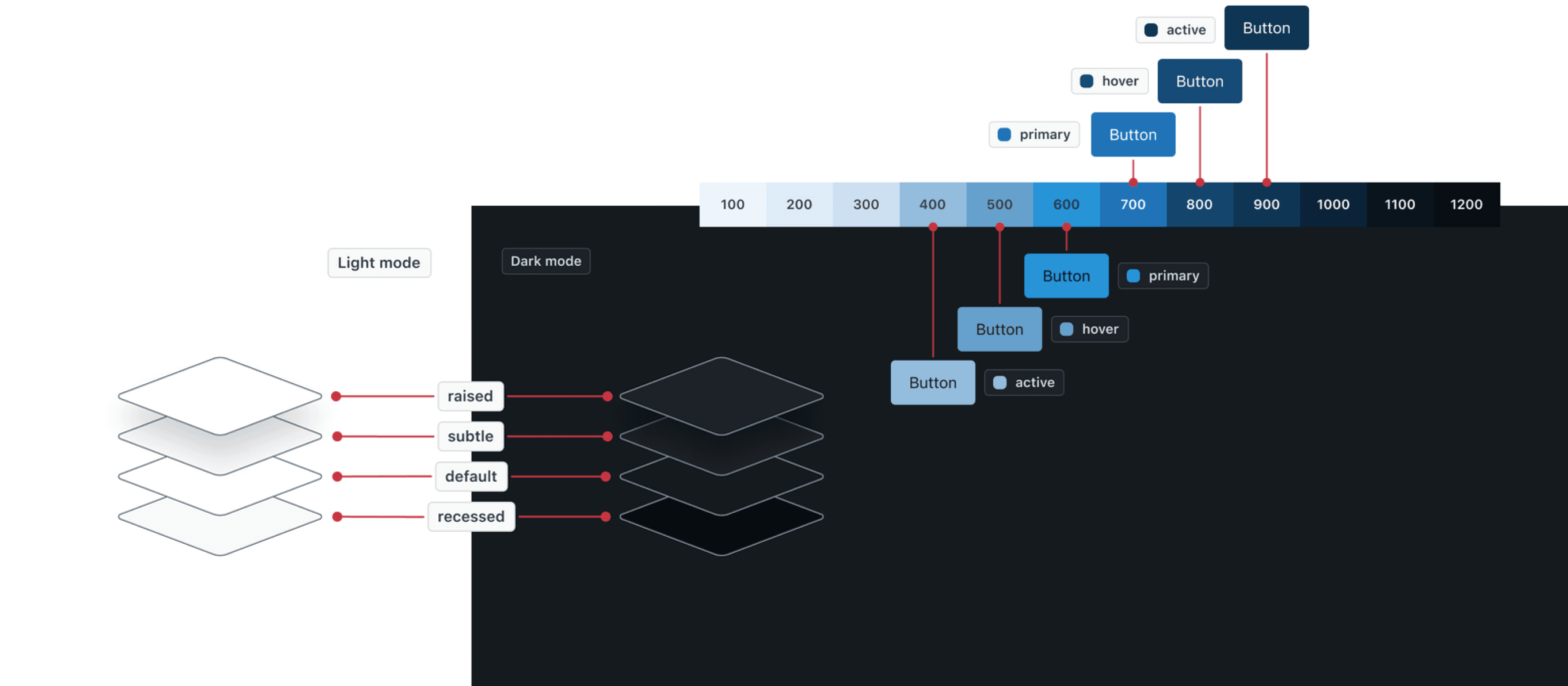
Semantic variables
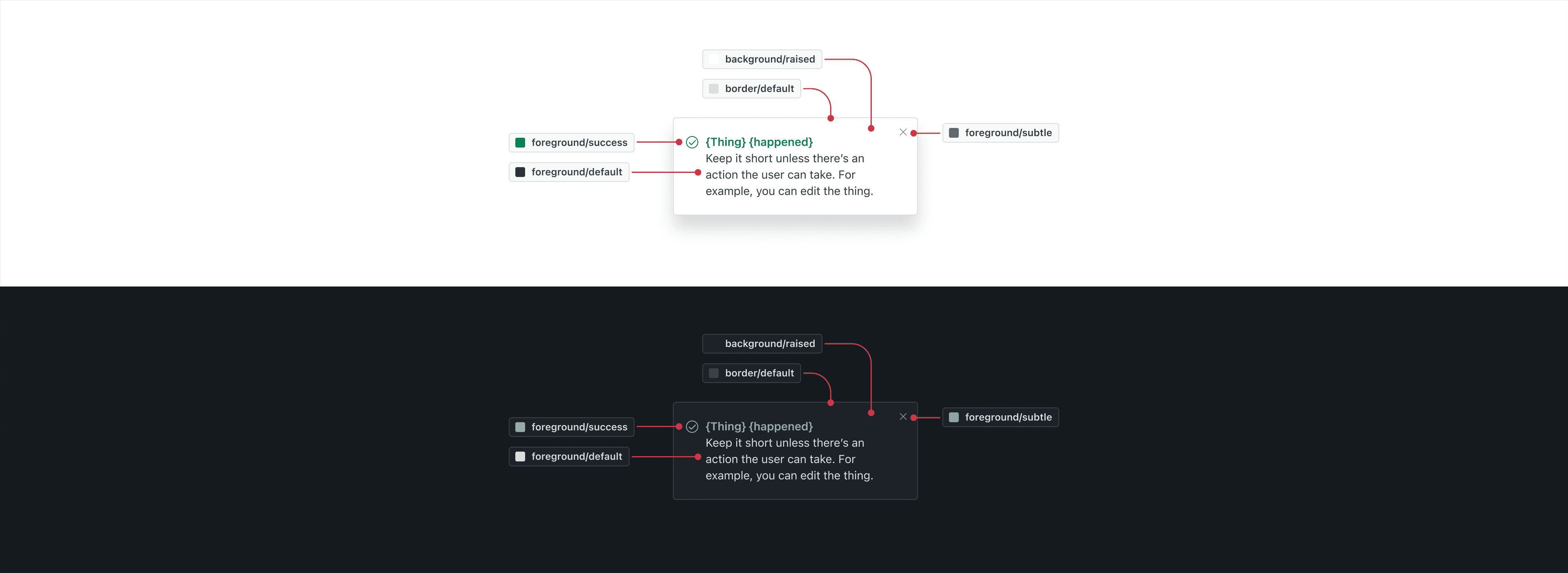
Semantic variables store values like fill colors, padding, visibility, and more—enabling components to adapt automatically across themes. Designers no longer need to manually swap colors between light and dark modes. By capturing design intent, this approach ensures greater consistency, improves accessibility, and streamlines the design process.
Light and dark modes
Every component shown is theme aware, allowing the various UI elements like text, borders, and fills to inherit the appropriate color across themes.
Drag the slider to view between light and dark modes
Updated color palette
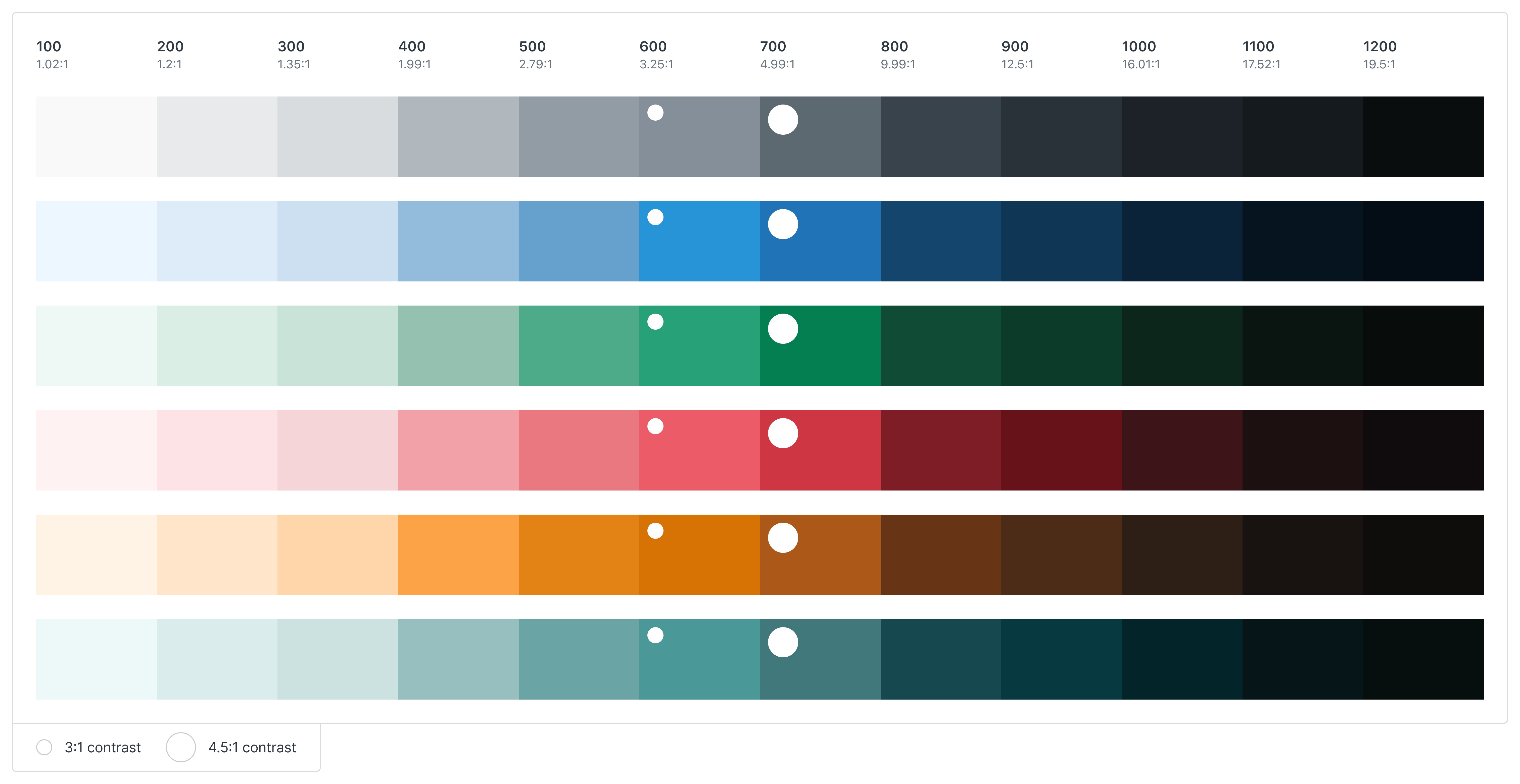

We rebuilt the palette using the LCH color model and expanded each hue from 8 steps to 12. This gave us more consistent progression of contrast and chroma across hues. Each scale was built by using the original colors as a base and then adjusted programmatically. Step 700 always provides a 4.5:1 contrast or higher. Step 600 always provides a 3:1 or higher contrast.
refined color principles
While turning on dark mode might be as simple as flipping a switch, learning to design for it wasn’t. We revisited our existing color principles and thoughtfully expanded them to work in a dark context—clarifying values such as visual hierarchy, color application, elevation, and opacity.
accessibility
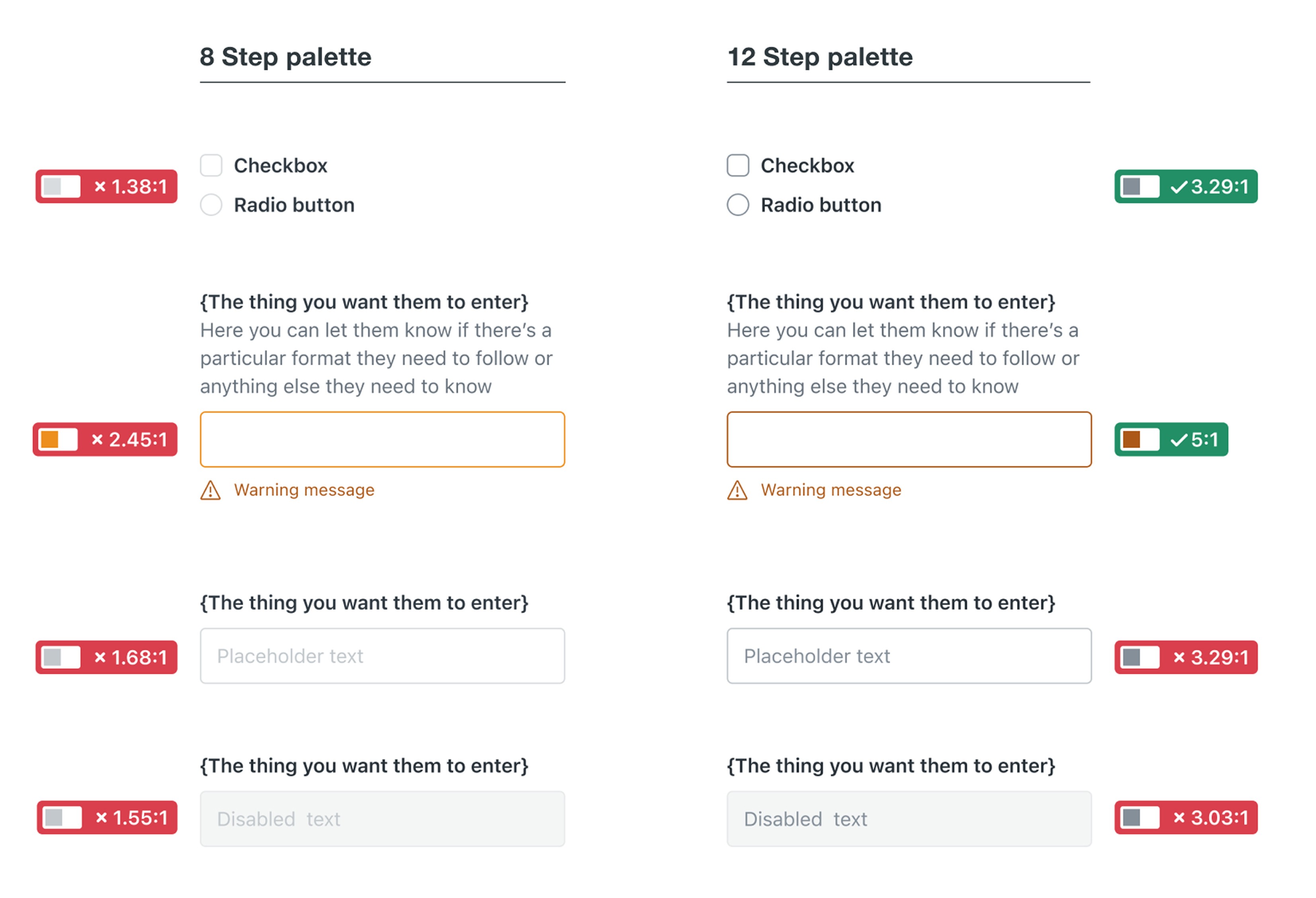
Input borders, checkboxes, radios, and warning messages were updated using new color steps (e.g., yellow-700, grey-600) to meet or exceed WCAG 2.1 contrast ratios. Where full compliance wasn’t yet possible, we prioritized partial improvements and shifted colors where appropriate. The new 12 step palette allowed us to make these changes without making one-off exceptions.
High fidelity prototype
We created a prototype using an unreleased test version of our component library updated with semantic variables.
It demonstrated a working dark mode switch across four key product areas—Support, Guide, Explore, and Admin Center.
Shared widely across the organization, it became a high-visibility proof of concept that validated our approach and rallied support for the project
Outcome
Garden v9 launched successfully, unlocking dark mode org-wide
Rapid rollout: Piloted the changes with one team and then scaled to other teams within 90 days. Every Garden component now theme aware, with all designers and engineers having access to updated libraries and documentation.
A11y wins: We resolved 12 accessibility violations related to color contrast alone. Without extra effort, teams can resolve 10+ additional a11y bugs just by upgrading to v9.
Complete enablement: Migration guides, live walkthroughs, and async docs gave teams everything they needed to get started. Teams could immediately start building dark mode experiences with clear support from the Garden team.
Sustained support: We resourced the Garden team to provide ongoing support from the start. Teams could rely on us for help designing and engineering dark mode experiences with confidence and clarity.